Behavioral Psychology & Decision Science
Frictionless Payments Without Hidden Costs: A Behavioral and Ethical Guide
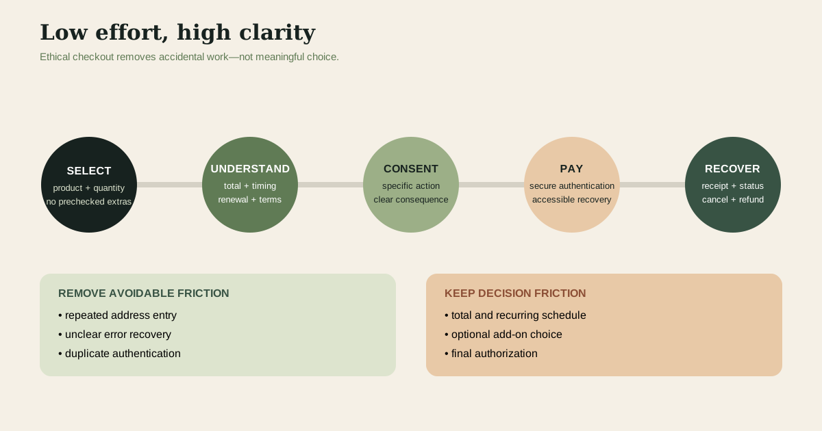
Payment friction includes the time, attention and steps between choosing an item and completing payment. Some friction is waste: retyping an address for a trusted repeat purchase adds effort without improving choice. Other friction carries information: displaying the full price, delivery terms and recurring schedule helps a buyer understand the commitment. Behavioral research on the “pain of paying” examines how payment salience and the coupling between consumption and payment affect experience and choice. It does not prove that every tap-to-pay transaction causes overspending, nor that cash is always superior. The design task is to remove accidental effort while retaining comprehension, control and an easy route back. Prelec and Loewenstein’s prospective-accounting model offers the conceptual foundation; Federal Trade Commission work on dark patterns defines the enforcement and consumer-protection boundary.
By Farvenzo Explained · Published · 6 min read
Salience makes the outflow visible; coupling links it to consumption
Payment salience describes how strongly the act of paying enters attention. Counting banknotes can make an outflow vivid; a stored credential can make payment recede behind the product action. Coupling concerns how tightly a particular payment is mentally linked to a particular consumption episode. Paying for a cinema ticket at the door is tightly coupled. Paying an annual membership months before individual visits loosens that connection. Prelec and Loewenstein argued that people may use prospective accounts that shape both enjoyment and the discomfort of payment across time.
These mechanisms are not a simple scale from virtuous cash to harmful automation. A transit pass reduces repeated payment attention and can make commuting practical. Automatic payment can prevent a missed utility bill. Prepayment may help a household budget, while a poorly timed annual charge may create hardship. Salience can also be excessive: repeatedly confronting a patient with a medical copayment may add distress without meaningful choice. Ethical design asks which information and control are necessary at the moment, not how to maximize or minimize friction in the abstract.
Cash and card studies have boundaries that product teams must respect
Research has reported differences in willingness to pay, recall or spending across payment methods, but effects depend on study design, population, purchase, credit access and era. Laboratory bids are not grocery budgets. People who choose credit cards differ from people who rely on cash, and card rewards or liquidity constraints can influence observed behavior. Payment technology also evolves. A result about signing a paper receipt cannot be transferred automatically to a biometric wallet. Product teams should not invent a universal basket-size increase or describe one behavioral pathway as a settled neurological fact.
Operational data have limitations too. If customers using a stored card spend more, the stored card may be a result of loyalty rather than its cause. Promotions, device type and order history can confound the relationship. A randomized interface test can identify effects in that context, but it still needs guardrails and should not deliberately induce unaffordable purchases. Report the outcome measured, the customer population, time window and uncertainty. Separate conversion from later cancellations, returns, chargebacks and complaints. A faster checkout that increases regret may destroy value after the experiment’s headline metric ends.
Worked example one: redesign a checkout around informed momentum
An illustrative meal-delivery service sees mobile shoppers abandon a six-screen checkout. The team combines address and delivery screens, supports secure wallet payment and keeps the order summary visible. Before the final action, the interface states the total, delivery date, cancellation cutoff and whether the purchase is one-off. Optional extras start unchecked and use the same visual weight as other choices. The purchase button names the consequence—“Pay $68.40”—rather than saying “Continue.” This removes repeated typing while preserving the information a reasonable customer needs to authorize the charge.
The experiment measures completion, time, support contacts, cancellation before shipment, refunds, chargebacks and a short comprehension check. Suppose completion rises but refund requests also rise because the delivery cutoff was misunderstood. The team does not call the design a success based on conversion alone. It revises the date presentation and tests again. No effect size is assumed in advance. The worked example shows a useful division: streamline data entry and authentication, but place price, timing and commitment where the customer can see them before consent.
Dark patterns manipulate choice rather than merely reducing effort
Authentication deserves the same ethical scrutiny as offer design. A one-time code, bank redirect or biometric check can protect payment, but it can also exclude a customer who changed phone numbers, shares a device or uses assistive technology. Provide secure recovery, explain why a step is required and avoid repeated challenges that train people to approve prompts without reading. Risk-based authentication should be monitored for unequal failure rates. Lower friction is not achieved when a customer must contact support to recover from a security control the interface never explained.
The FTC describes dark patterns as design practices that can trick or manipulate consumers into choices they might not otherwise make. Examples include disguised advertisements, buried material terms, hard-to-cancel subscriptions, preselected add-ons and interference that makes privacy choices unequal. A bright button beside a faint decline link is not neutral simply because both technically exist. Nor does disclosure cure an interface that repeatedly interrupts refusal. The legal analysis depends on facts and jurisdiction, but the design lesson is stable: important options should be understandable, comparable and operable without a scavenger hunt.
Consent is specific and revocable. Saving a card for one purchase does not necessarily establish informed agreement to a recurring plan. Recurring checkout should state amount or calculation, frequency, trial end, renewal, cancellation method and material changes. Records should show the terms presented and the user’s action. Avoid countdown timers unless the deadline is real, and do not claim scarcity from another shopper merely viewing an item. Ethical urgency communicates an actual constraint. Manufactured urgency converts the customer’s attention limit into a sales tool and can invite complaints, enforcement and loss of trust.
Worked example two: repair a subscription and refund journey
A fitness application offers a seven-day trial that converts to an annual plan. In the original flow, the annual price appears in small text, cancellation requires a web login, and refund eligibility is hidden in a help article. The redesign presents “$96 charged annually after 7 days” next to the start action, sends a reminder before conversion, provides cancellation in the account surface used to subscribe, and confirms the effective date. The refund page explains the policy, asks only information needed to locate the charge, and gives a reference number immediately.
Assume, illustratively, that short-term trial starts fall while support tickets, disputed charges and involuntary churn also fall. The business should value the retained informed customer differently from a customer captured by confusion. It can compare net revenue after refunds, payment fees and support cost across cohorts, but it should not withhold required consumer protections while waiting for statistical significance. If a regulator or platform rule requires a cancellation method, compliance is a floor. Experimentation belongs in clearer wording and service recovery, not in whether a user can escape.
Measure comprehension, control and recovery alongside conversion
A responsible checkout scorecard includes task completion, error, time, price comprehension, add-on awareness, cancellation, refund, chargeback, complaint and accessibility. Segment carefully to detect whether the flow disadvantages older users, assistive-technology users or people with limited language proficiency. Session replay and support transcripts can reveal confusion but may contain sensitive data; collect them with a clear purpose, limited retention and access controls. Privacy notices should not become another manipulative hurdle. The evidence program must respect the same autonomy the interface claims to support.
Refunds are part of product design, not a back-office concession. A fair process states eligibility, timing, destination and status. It distinguishes fraud controls from blanket obstruction and offers human review for unusual cases. Businesses can reduce abuse with transaction evidence and account security without forcing every customer through needless steps. The strongest commercial objective is not zero friction. It is low avoidable effort, high decision clarity and reliable recovery when expectations are not met. That combination can support trust without making an unsupported promise about how any payment method rewires behavior.
- Distinguish useful disclosure and confirmation from avoidable typing or navigation.
- Treat cash-card findings as context-dependent evidence, not universal effect sizes.
- Display total price, recurrence, timing and cancellation before the customer authorizes payment.
- Measure refunds, disputes, comprehension and support burden together with checkout completion.
- Design cancellation, consent withdrawal and refunds as first-class parts of the customer journey.
Sources
Keep exploring
- The Sunk-Cost Test: When Completion Is Rational and When Exit Creates Value →
How to separate irrecoverable spending from recoverable value, calculate forward NPV, recognize escalation incentives, and design exit rules.
- First Principles Without Founder Mythology: A Method for Cost and Constraint Analysis →
How to decompose outcomes and costs, respect physics and regulation, test inherited assumptions, and validate delivery and manufacturing changes.
- Prospect Theory Without the Two-to-One Myth →
How prospect theory describes reference-dependent choice without prescribing investments or asserting a universal loss-aversion ratio.